
AccessLens
A mobile experience that lets anyone point their camera at real-world text - a label, a sign, a menu, a leaflet - and instantly receive a clear, spoken, context-aware explanation powered by AI. Built end-to-end as a working product, not a mockup.
- Role
- Product Designer · UX Designer · AI-Assisted Builder
- Timeline
- Concept Project
- Team
- Solo
- Category
- AI-Powered Accessibility Assistant
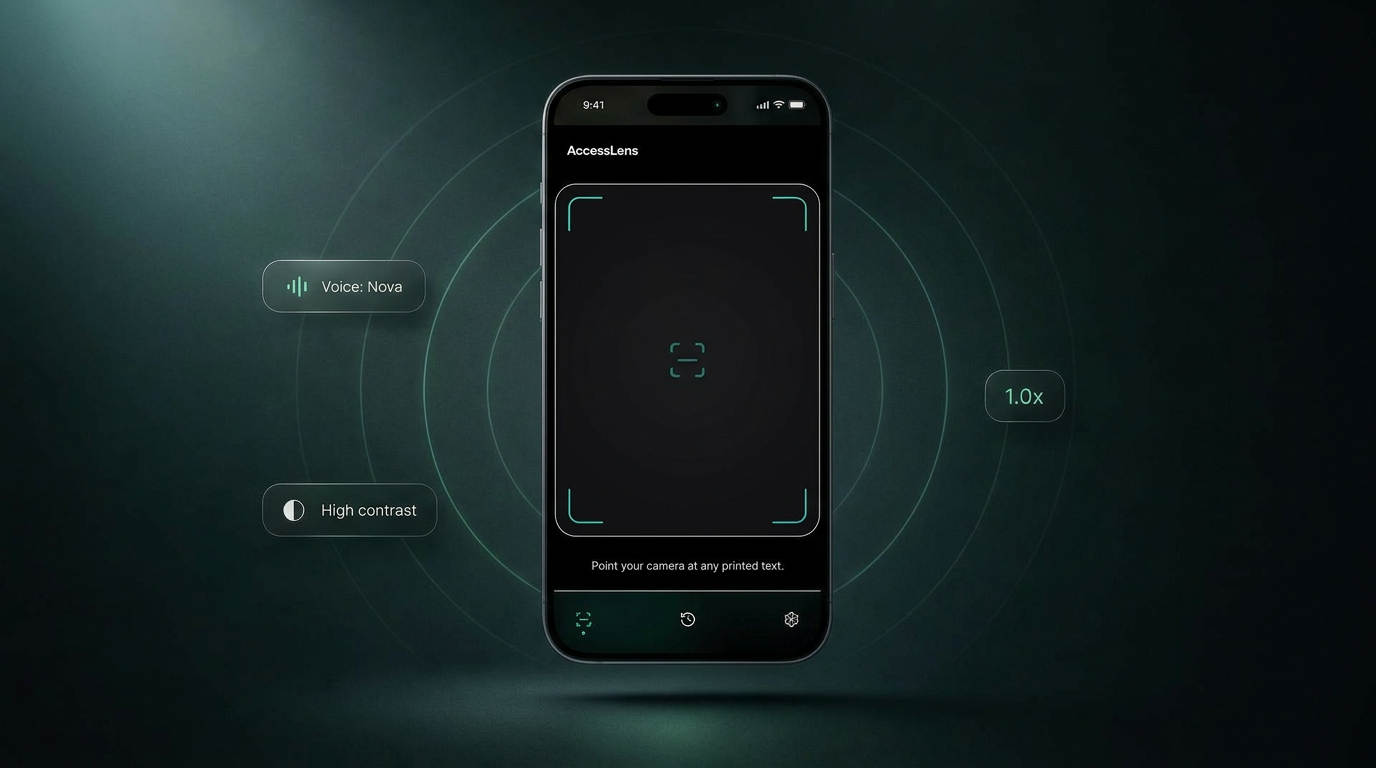
- What it is
- AI-powered accessibility assistant for understanding real-world text.
- Who it's for
- People with low vision, dyslexia, color blindness, language barriers, and anyone needing faster understanding.
- Core interaction
- Point → Capture → Understand → Ask
- Built with
- Product design + AI-assisted development + working prototype.
The problem this product set out to solve.
What people faced
Everyday environments are full of text most products quietly assume you can read - small print on packaging, faded signage, dense menus, multi-language instructions. For users with low vision, dyslexia, cognitive load in unfamiliar situations, or anyone navigating a second language, that assumption breaks the moment they leave a screen.
The landscape
Phones already ship with magnifiers, screen readers, and live translation, but each tool is siloed. Users have to know which feature to invoke, and the output is usually a literal transcription rather than an answer to what they actually wanted to know.
Why it matters
Accessibility tooling has historically optimised for compliance. The opportunity now is to optimise for understanding - using AI to move from 'reading text aloud' to 'explaining what this is, in your words, in your moment'.
How the product direction was validated.
Before exploring interfaces, I focused on understanding the accessibility landscape, existing solutions, and recurring user pain points. The objective wasn't to validate a design—it was to validate whether the problem itself deserved solving.
Competitive Analysis
Reviewed 18 accessibility applications to identify capability gaps, recurring interaction patterns and opportunities.
User Survey
Collected quantitative feedback from 62 participants to understand common frustrations, workflows and unmet needs.
Accessibility Research
Referenced WCAG 2.2 guidelines, platform accessibility recommendations and inclusive design principles.
Problem Framing
Synthesized findings into key opportunity areas and prioritised problems based on frequency, impact and feasibility.
Design Principles
Translated research into actionable product principles that guided every interaction and visual decision.
Design decisions should emerge from validated user problems—not assumptions. This process helped define the product strategy before a single interface was designed.
Research & Validation
Before designing AccessLens, I validated the problem through user surveys, accessibility research, WCAG guidelines, and competitive analysis to understand where existing assistive experiences fall short and where meaningful opportunities existed.
Blind, low-vision and accessibility-aware participants.
Competitor benchmarking across OCR, object detection and assistive experiences.
Design feedback gathered from accessibility practitioners and inclusive design advocates.
Design decisions aligned with WCAG principles and mobile accessibility best practices.
Key Research Insights
Participants reported difficulty identifying text, objects or surroundings in unfamiliar environments.
Users frequently switched between multiple accessibility apps to complete one everyday task.
Preferred one unified accessibility experience instead of separate OCR, object detection and colour recognition tools.
Preferred voice-first feedback over text-heavy interactions.
Most Common Accessibility Challenges
- Reading Printed Text84%
- Object Recognition79%
- Using Multiple Apps76%
- Colour Identification72%
- Navigating New Environments64%
- Small Interface Controls58%
Competitive Analysis
| Feature | Seeing AI | Google Lookout | Be My Eyes | AccessLens |
|---|---|---|---|---|
| OCR | ✓ | ✓ | ✓ | |
| Object Recognition | ✓ | ✓ | ✓ | |
| Colour Detection | ✓ | ✓ | ||
| Voice Guidance | ✓ | ✓ | ✓ | ✓ |
| Offline Support | ✓ | ✓ | ||
| Unified Experience | ✓ |
Voices From Research
I don't want four different accessibility apps just to complete one simple task.
Voice guidance is much faster than trying to read every screen.
Finding objects around me is often harder than reading text.
Research Takeaways
Reduce Cognitive Load
Users value fewer decisions and fewer app switches more than feature quantity.
Accessibility Is About Confidence
Fast voice guidance and contextual awareness increase confidence in unfamiliar environments.
One Experience, Multiple Tasks
Combining OCR, colour detection and object recognition into one workflow simplifies everyday interactions.
This concept is informed by secondary research, accessibility guidelines, competitive analysis and user surveys. The findings shaped the product strategy and interaction model before visual exploration began.
The principles that guided every decision.
Accessibility First
Inclusion is the product, not the polish. Voice, contrast, pace and colour vision are first-class surfaces - not toggles buried in settings.
Voice Before Screen
People want answers, not text. The product speaks a short AI-summarised answer first; the transcript lives below, on demand.
Honest Uncertainty
When the model isn't sure, it says so out loud. 'I'm not sure' is a designed response, not a fallback.
Calm by Default
Quiet surfaces, generous touch targets, a single accent for interactive moments. The camera feed and voice are the experience.
The calls that shaped the product.
Four product calls did more to shape AccessLens than any visual decision. Each one started from a real-world failure mode in existing accessibility tools, and each one cost something in return.
Accessibility presets over a settings panel
Every existing tool I audited handed users with access needs a long list of toggles and expected them to assemble their own experience before the product became useful.
Lead with intent-based presets - Blind, Low vision, Dyslexia, Colorblind - that configure voice, contrast, motion and verbosity in a single tap. Individual controls stay available underneath.
Onboarding cost falls hardest on the people the product is meant to help. The product should make the first move toward the user, not the other way around.
Voice-first interaction, screen as fallback
Camera assistants typically dump literal OCR into a wall of text. For audio-first users, that's noise; for everyone else, it buries the actual answer.
Treat voice as the primary surface. The product speaks a short, AI-summarised answer first; the full transcript and bounding boxes live below, on demand.
People don't want text - they want answers. Designing for the ear forces brevity and hierarchy that improves the screen experience too.
Reading speed as a first-class control
Default speech synthesis is paced for sighted users glancing at captions. Power screen-reader users want 1.5–2x; new users often need 0.75x to follow at all.
Pair a continuous slider with discrete presets (0.75x–2x), keep the current rate visible, and let speed adjust live during playback rather than only on the next capture.
Pace is personal and changes with context - a medication label and a restaurant menu deserve different cadences from the same product.
Color vision as a mode, not a filter
Generic 'dark mode' or 'high contrast' settings don't fix how specific colour pairs collapse together for specific conditions, and they ask users to self-diagnose in product language.
Expose color vision as a named, first-class mode - Protanopia, Deuteranopia, Tritanopia, Achromatopsia - that remaps the accent system and ensures every state is also carried by shape, label or position.
Naming the condition removes the translation step and forces the design system itself to stay honest: if a state stops reading without colour, it was under-designed to begin with.
Product Experience
A walkthrough of the complete user journey — the interaction patterns, accessibility decisions, and AI behaviour that shaped the product, from first launch to a saved scan in history.
Getting Started
First-run keeps the ceiling low: the app introduces itself, tunes for the person using it, and asks for exactly the permissions it needs — no account, no signup, no dark patterns.
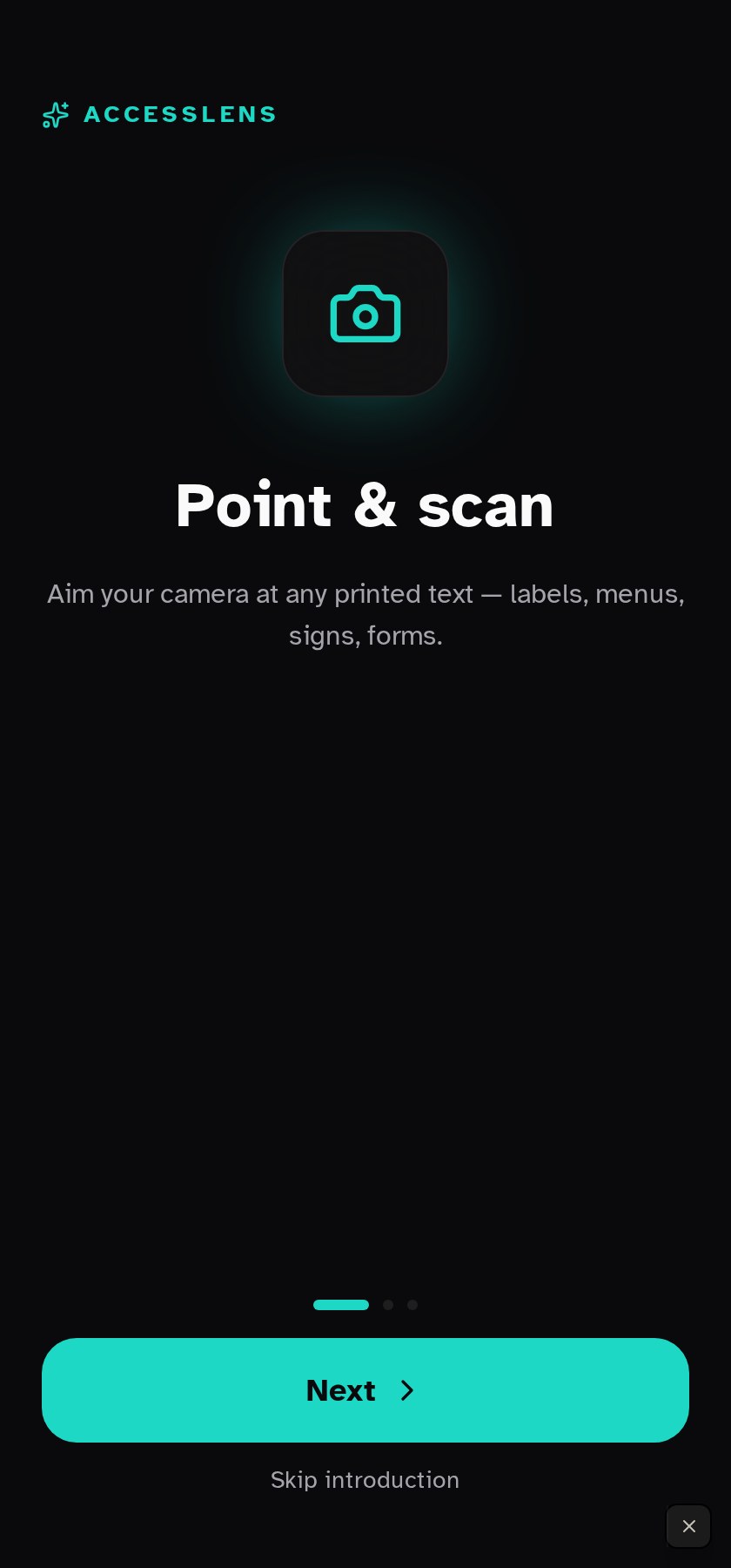
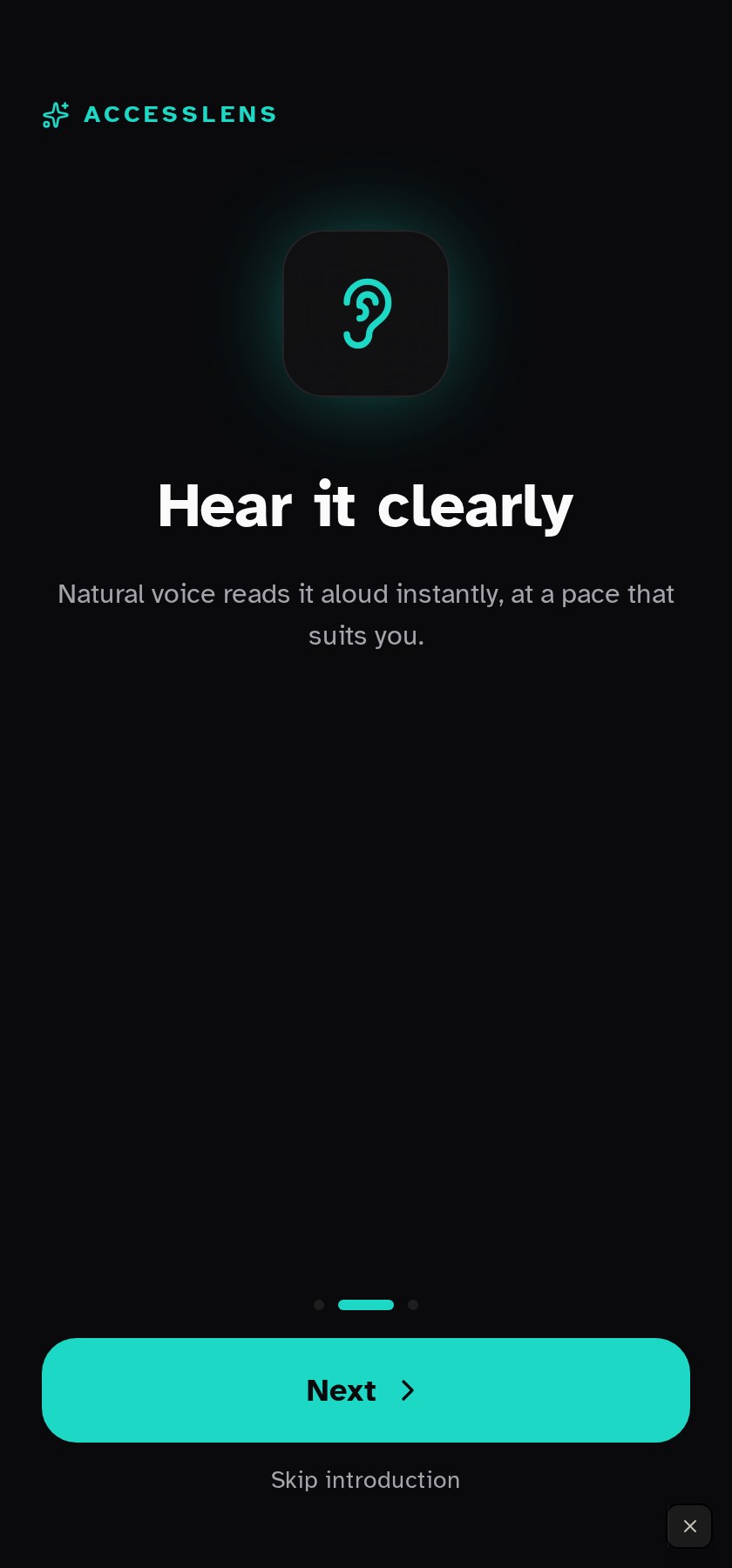
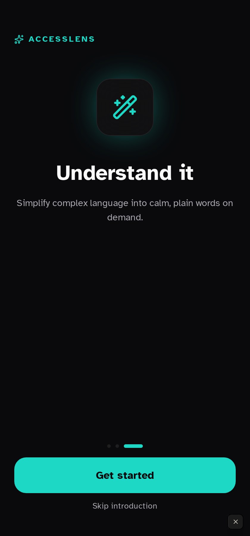
Understand what the app does in under 30 seconds and get to the camera without friction.
Every step is voice-narratable, uses XL type and 44px+ tap targets, and can be skipped with a single visible action.
Nothing is uploaded yet. Onboarding sets voice, pace, and reading preferences the AI will honour on the first scan.
Core Product Experience
The heart of AccessLens: point, capture, understand. Four screens working as one continuous surface — the camera never feels like it's handing you off to another app.
Get from 'I need to read this' to a spoken answer in under three seconds.
One primary action, three secondary tiles, and a live 'Recent scans' rail — everything else lives on the tab bar.
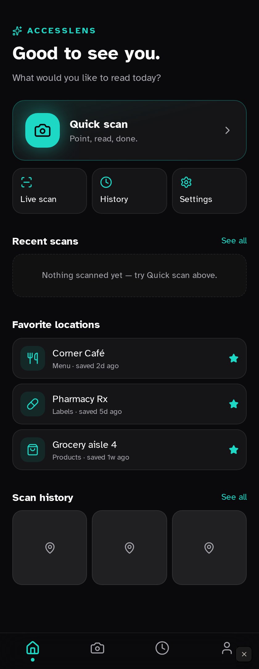
The Quick scan card is the largest interactive element on the page and reachable one-handed on any modern phone.
Favorite locations pre-warm the model with context — a menu scan at Corner Café is expected to be a menu, not a random block of text.
Live Camera → AI Processing → Result
The scan loop is three screens the user sees back to back. Each one is instrumented to keep the person oriented: what's happening, how confident the model is, and what they can do next.
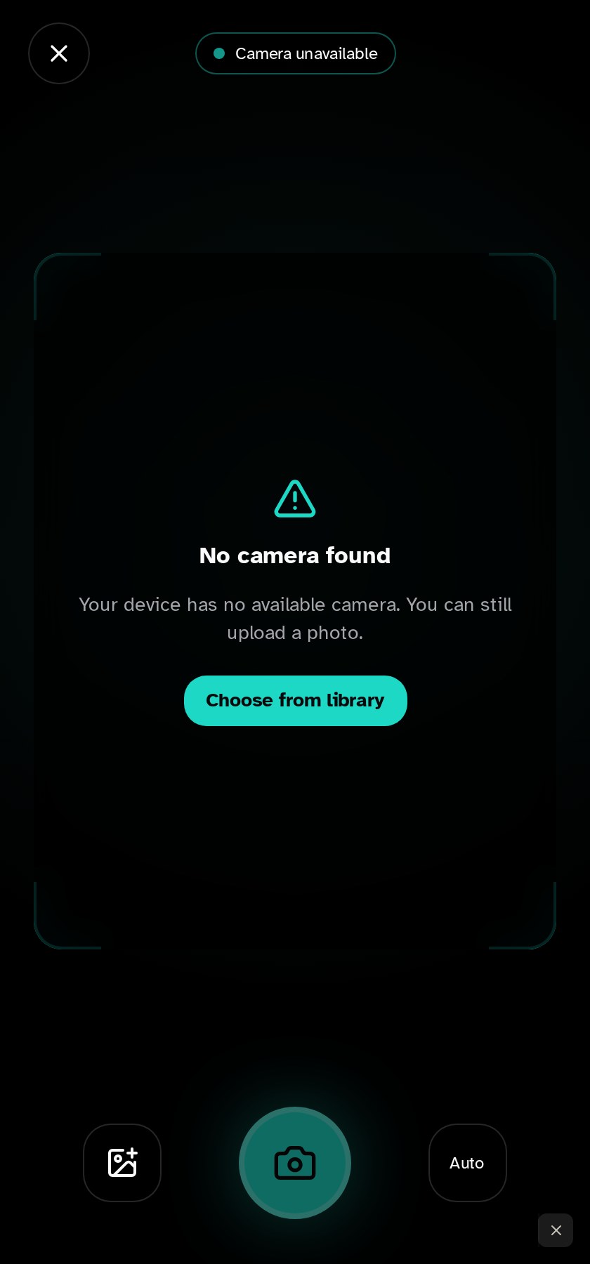
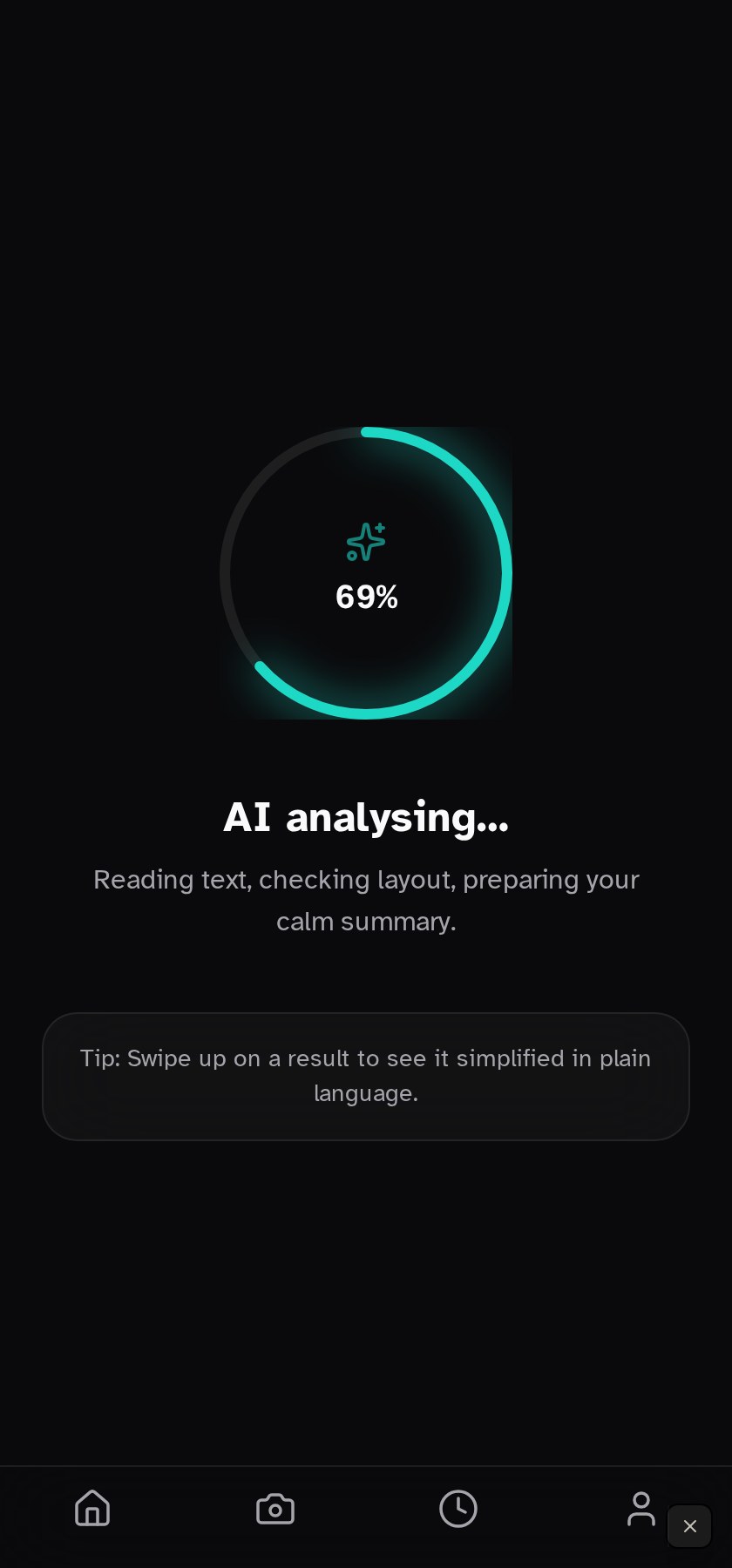
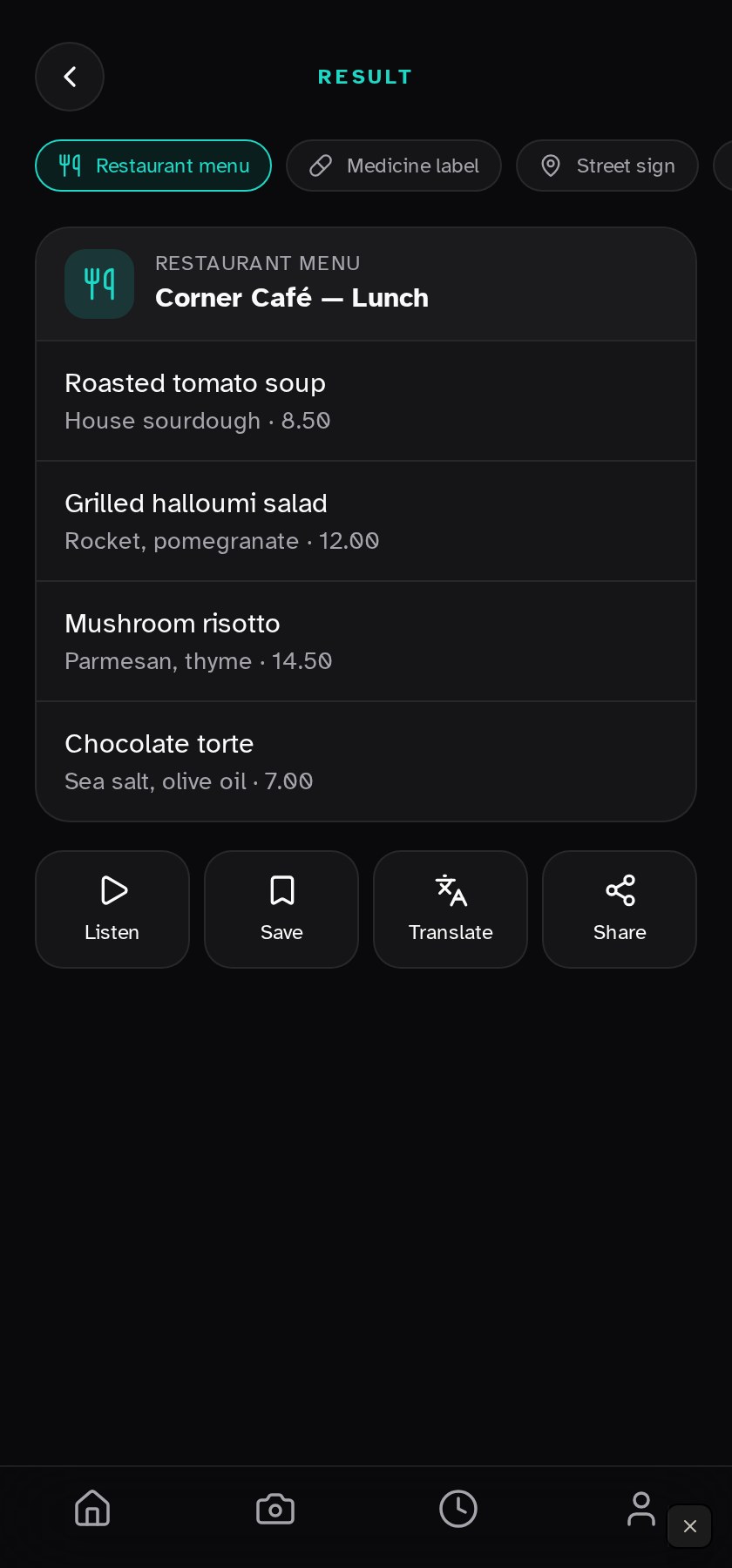
The camera surfaces a live confidence meter so a user can adjust distance before capture — no 'try again' cul-de-sac after the fact.
Processing narrates its work ('reading text, checking layout') so uncertainty is designed, not hidden. A tip surfaces voice commands available on the next screen.
The result reads a one-sentence summary aloud first, then reveals the structured detail. Save, Translate and Share sit under the thumb.
Supporting Experiences
The surfaces the user returns to over weeks, not seconds. History, Settings, and Profile follow the same rules as the camera: one primary object per screen, large touch targets, and every control speaks its own name.
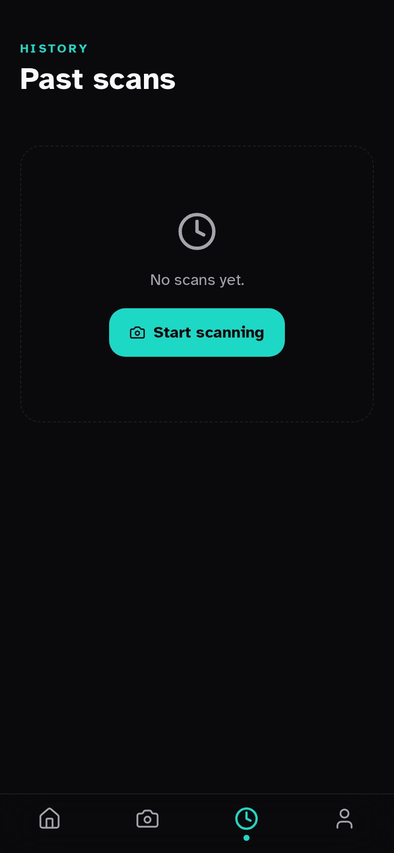
Every capture is stored locally by default. Grouped by day, replayable in one tap, deletable in two — no cloud, no accounts.
Return to a menu, a medication label, or a street sign the user saw yesterday, without re-scanning it.
History entries store the AI summary and the raw transcript so future models can re-answer follow-ups without a new capture.
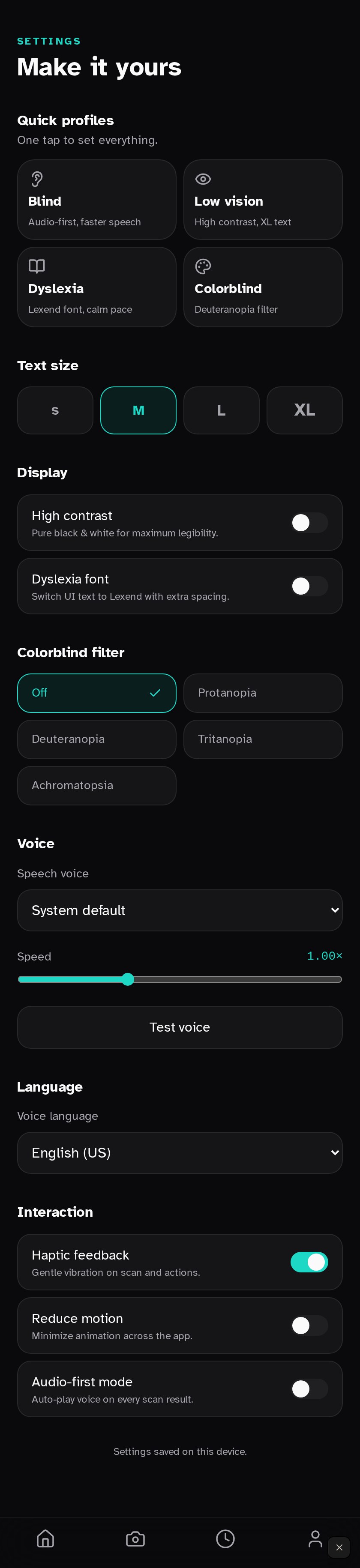
Accessibility Settings
Accessibility isn't a menu in AccessLens — it's the product. This screen makes that promise concrete: quick presets for the four audiences we designed for, plus fine-grain controls that don't punish you for being specific.
Four one-tap presets configure voice, pace, contrast and typography together so no one has to know which lever to pull.
Speed lives next to the presets — the single control users adjust most often is one tap from the home tab, never buried.
Every toggle has an on-screen label, a spoken label, and a distinct icon. Nothing relies on colour alone to communicate state.
Profile & Privacy
Profile is deliberately quiet. Usage lives here for people who want to see it; privacy controls are one screen deep because the answer to 'what happens to my scans?' should never be 'it depends'.
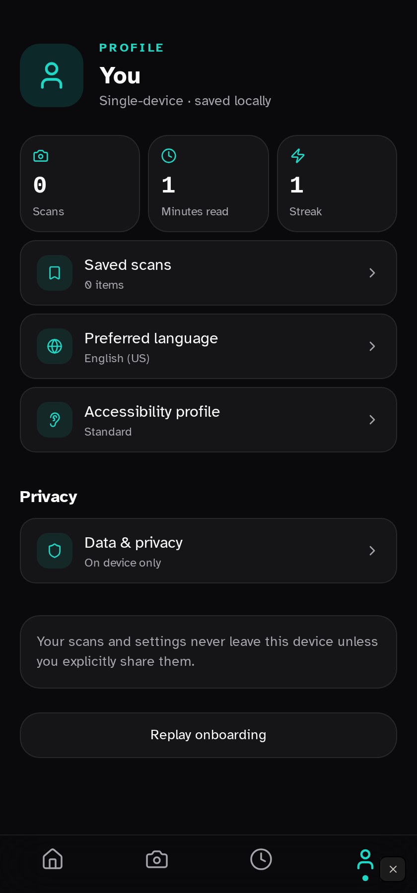
Weekly scan count, average confidence, and time saved — presented as a rhythm, not a gamified streak.
Local-first by default. A single toggle governs whether images ever leave the device; the state is spoken aloud whenever it changes.
Trust the product enough to keep using it — and know exactly how to walk away with all data intact.
The vocabulary behind every screen.
The visual system is intentionally quiet so the camera feed and voice are the experience. High-contrast surfaces, generous touch targets, and a single accent colour for interactive moments.
Palette & semantics
Scale & voice
Reusable building blocks
Capture Button
Large, always-thumb-reachable. Long-press to switch to continuous narration.
Summary Card
Top-anchored, voiced automatically, expandable into full transcript and source bounding boxes.
Ask Bar
Unified text + voice input for follow-up questions. Stays anchored across screens.
Confidence Pill
Small inline indicator that communicates how sure the model is, in plain language.
Designed to include
- Designed first for screen-reader-only use; sighted use is the secondary path.
- All actionable elements ≥ 44pt with 4.5:1 minimum contrast.
- Speech rate, voice, and verbosity adjustable from a single screen.
- Haptics confirm every capture so users never depend on visual feedback.
- Dynamic Type and reduced motion respected end-to-end.
- All AI-generated content announced as AI-generated, with a path to the raw text.
AI-assisted development, prototyping, and validation.
I'm a designer, not a software engineer. AccessLens is the first project where I closed that loop end-to-end - taking the concept from sketches into a working prototype using AI-assisted development tools, so I could feel the product instead of only presenting it.
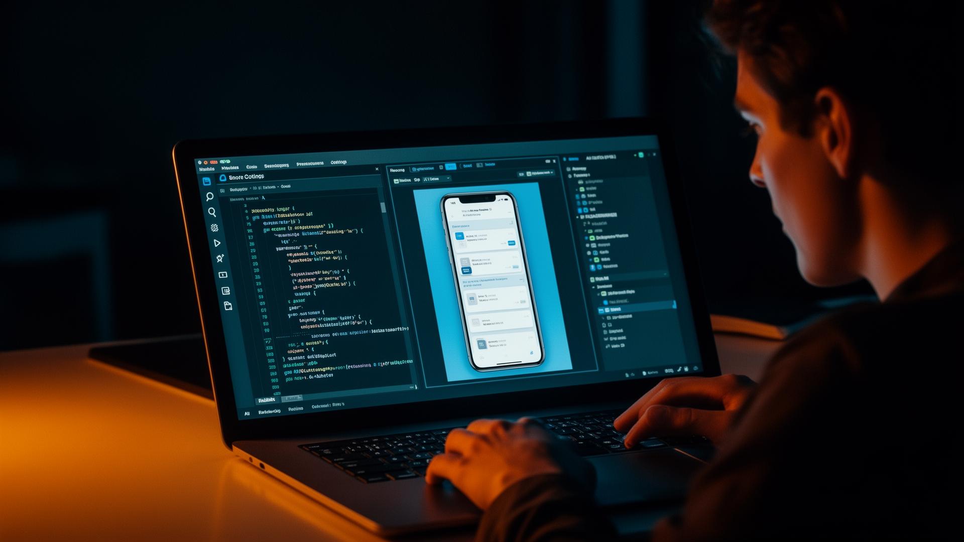
What it actually took
Rapid prototyping
I used AI-assisted tooling to scaffold screens directly from design intent, then iterated against the live prototype instead of static frames. Decisions that used to take a spec doc now took a build cycle.
AI-assisted development
Rather than write production code, I directed AI as a pair - describing behaviour, reviewing output, and refactoring with intent. My job stayed design; the implementation became a conversation.
Product validation
Holding the prototype in my hand surfaced problems no Figma file would - voice pacing felt slow, the capture button drifted under my thumb, the summary card crowded the camera. Each one was fixed in build, not deck.
Learning through building
Every loop taught me something about latency, state, permissions, and the shape of real software - context that now flows back into stronger, more buildable design decisions.
Closing the gap
The point isn't to become an engineer. It's to remove translation loss between intent and implementation, and to design products I can actually test against reality.
“The fastest way to know if an idea is real is to use it. AI made that possible without abandoning the craft of being a designer.”
What this work achieved.
As a concept project, success is measured in clarity of thinking and the strength of the prototype - not in shipped metrics. The intended outcome is a clearer, more humane pattern for how AI can sit between people and the physical world.
What I took away
- Accessibility framing sharpens product decisions for everyone, not just edge cases.
- Voice UX requires the same discipline as visual UX - pacing, hierarchy, restraint.
- AI features are only as good as how they behave when they're wrong.
- Saying 'I'm not sure' is a design decision, not a fallback.
What worked and what I'd improve.
- - Leading with intent-based presets removed onboarding cost from the people the product is meant to help.
- - Designing for the ear first forced a brevity and hierarchy that improved the screen too.
- - Treating colour vision as a named mode kept the design system honest - every state also reads in shape and label.
- - Push the confidence model further so the product degrades gracefully in low light and partial captures.
- - Add a richer follow-up history without compromising privacy.
- - Test with real low-vision users instead of designing against research alone.
Where this could go next.
- Real-world testing with low-vision users and accessibility communities.
- Wearable form factors - glasses and earbuds - where the camera surface disappears.
- Domain-specific modes for medication, finance, and travel.
- Tighter on-device fallback when connectivity drops.
- Richer history and saved-item patterns without compromising privacy.
- Personalisation - voice, verbosity, and vocabulary - that learns over time.
AccessLens starts as a single mobile surface, but the long arc is an ambient assistant for the physical world - quietly available across devices, sharper at saying 'I don't know', and earning trust by being useful in the moments that matter most.